


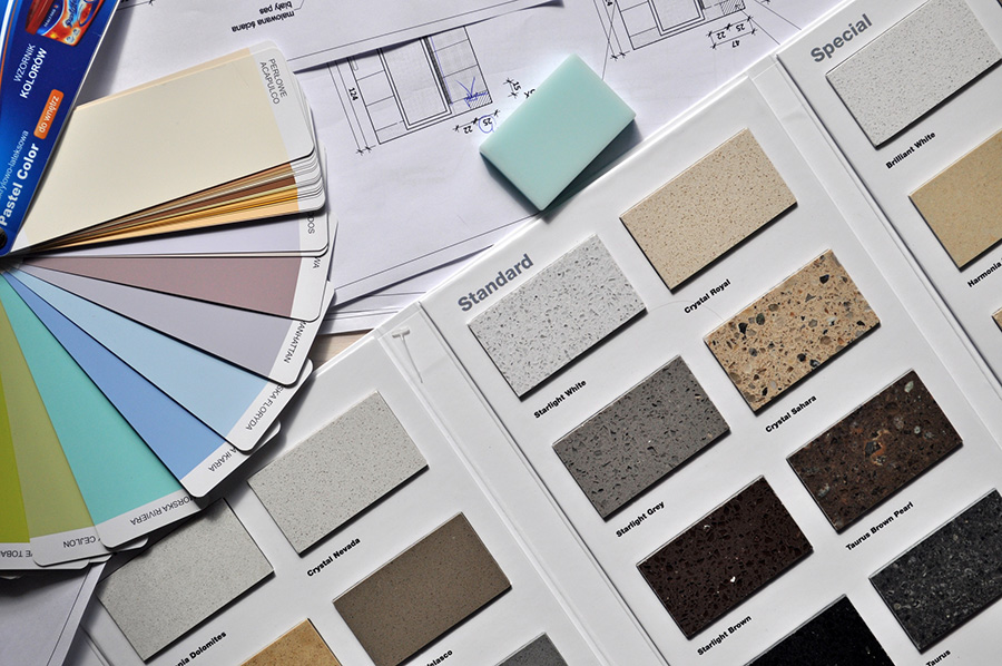
You pick a gorgeous paint color, roll it on the walls, and it looks perfect at 10 a.m.—then muddy and dull by dinner. The same thing happens with floors: that “warm gray” sample that looked soft in the store can turn chilly purple on a cloudy January afternoon. Our light changes all day, and all year, which means wall color and flooring have to work together, not fight for attention.
Below are practical ways to pair paint and floors—especially luxury vinyl and laminate—so your rooms feel inviting in every season.
How Northeast Ohio Light Changes Your Colors
Our four-season light swings from bright summer sun to long, low winter days. That shift affects how both paint and flooring read in your home.
In winter, the cooler, bluer daylight can make gray walls look icy and can pull cool undertones out of floors. A luxury vinyl plank with subtle beige can suddenly feel more taupe or even slightly green. In summer, strong afternoon sun can wash out pale colors and exaggerate contrast between dark floors and light walls.
The safest approach is to think in undertones, not just names. A “greige” wall with a warm undertone will soften the look of a medium oak-look luxury vinyl plank. A slightly creamy white will keep a cool-toned floor from feeling stark when the sky is overcast. When you start browsing, it helps to compare your paint chips directly with actual planks from our luxury vinyl collection rather than guessing from photos.
Coordinating Wall Colors with Wood‑Look Luxury Vinyl
Most homeowners here choose wood visuals in LVP because they bring warmth without the upkeep of hardwood. To make those floors and walls feel intentional together, focus on contrast, depth, and mood.
If your plank is a light oak or maple look, soft, mid-tone wall colors usually work better than very pale ones. A gentle greige, clay beige, or muted blue-green gives enough contrast so the floor doesn’t disappear, but it still feels airy on gray days. Darker, espresso-style luxury vinyl calls for balance the other way: off-whites, pale stone colors, or very light taupes keep the room from feeling heavy once the early sunsets hit.
Pattern and texture matter, too. Wood visuals with a lot of variation pair best with simpler, quieter walls. If the plank shows knots and heavy grain, a clean, low-chroma wall color will keep the room from looking busy. When you’re comparing options in person, you can see our luxury vinyl styles side by side and hold paint swatches right up to the boards under natural light.
When Laminate Makes Sense—and How to Match It
Laminate shines in busy spaces where you want a wood look and extra dent resistance. It tends to have more pronounced patterning, so wall color has to calm things down instead of adding more visual noise.
For very realistic, matte-finish laminate, you can treat it much like luxury vinyl: read the undertone in the “wood” (cool gray-brown, golden, or neutral) and echo that temperature in your paint. A cool walnut-look laminate, for example, looks cohesive with soft cool neutrals and inky accent walls, while a honey-toned plank loves sandy beiges and warm whites.
If you’re working with a more dramatic laminate pattern—strong contrast from board to board, heavy texture—let the floor be the star. Choose walls that are one to two steps lighter than the lightest tone in the plank. That approach keeps the space grounded but avoids the cave effect during long stretches of cloudy weather. To see how different patterns behave under real daylight, many homeowners like to explore our laminate options in the showroom and then borrow samples home.
Testing Colors in Real Northeast Ohio Light
The best color theories still need a reality check in your own rooms. Our sky can change from bright to overcast in a single afternoon, so plan to test both paint and flooring.
Start by taping large paint swatches on at least two walls and placing flooring samples directly at the base of each. Look at them morning, midday, and evening, with lights on and off. If a color only looks good for two hours, it’s not the right choice. Aim for combinations that stay pleasant, even if they shift slightly through the day.
Because flooring is a longer-term commitment than paint, most people pick the floor first, then fine-tune the wall color. At our design center, we often help families narrow down a few realistic floor choices—whether that’s waterproof LVP for a lower level or durable laminate for a busy main floor—and then talk through paint families that flatter each one. If you’d like guidance tailored to your rooms and light, you can get expert help on your project and we’ll walk you through samples, coordination, and installation timing.


